The Fundamentals of Color Psychology
If you’ve ever done any design, you know at least a bit about color psychology and at least know that we all associate specific emotions with each color.
Red is passion, blue is soothing, and so on. Yellow is playful, but why is it such an uplifting color? It is tempting to stick to a simple feeling, but this is precisely too simplistic an explanation. Think about it: if the associations that we establish between emotions and colors were innate, they would not vary from one culture to another and would not change over time (one thinks in particular of pink which was once a color for the boys).
People decide whether or not they like a product in 90 seconds or less. 90% of this decision is based on color alone. Color is perception. Our eyes see something (the sky, for example), and the data sent from our eyes to the brain tells us that it is such a color (blue in this case).
One thing is certain, colors play an important role. That’s why you need to familiarize yourself with the basics of color psychology before determining which shade will best represent your brand. Once you know what a particular color evokes, you will be able to take advantage of its connotations to create your brand image and communicate your values.
What is color psychology?
Color psychology is the study of how the colors we perceive influence our thoughts and emotions.
But before we dive into actual color psychology, we need to define exactly what a color is.
Although we think we see different hues, the colors are actually light waves of different lengths. Light exists on the electromagnetic spectrum, which ranges from the longest light waves to the shortest. Radio waves, microwaves, infrared light, gamma rays, and X-rays are all at different length segments on this spectrum. In the center is a small spectrum of light waves measuring between 400 and 700 nanometers, and which corresponds to the light perceptible by the human eye, and gathers all the colors that we see.
Researchers who work in the field of color psychology study the primitive and cultural associations we make with specific colors, and how being exposed to those colors influences our biases and behaviors.
Let’s take a concrete example. An experiment in Scotland and Japan showed that when a neighborhood’s streetlights were fitted with blue light, that neighborhood’s crime and suicide rate decreased significantly. Researchers in color psychology are trying to explain why such phenomena occur.
This could be because blue is an unusual color for streetlights, which gives potential criminals the impression that something is not as usual and thus causes them to abandon their plans. But it could also be because blue is often associated with the police, so we should be more cautious. Or it could still be because blue is an almost universally recognized soothing color, and one that could have a positive and calming influence on those exposed to it.
The language we speak influences the colors we perceive
Our ancestors did not see the same colors as us. And besides, we don’t even see the same colors as people in other places in the world. This may sound a bit exaggerated, but it is nevertheless very true. Studies have shown that the language we speak influences the way we perceive colors.
A 2006 study revealed that members of the Himba tribe, a culture in Namibia that has no word for the color “ blue”, could not identify a blue square among several green squares, because for them , they were all green. Anglophones have no difficulty in carrying out this task.
On the other hand, when presented with several green squares, including one of a slightly different shade from the others, the members of the Himba tribe are able to immediately identify the different square from the others, which English speakers fail to identify. TO DO. This is because the language of the Himba tribe, Otjihimba, has words to describe most of the hues that English speakers simply refer to as “green”.
Now think about how fundamentally the ocean and the color blue seem to us to be related to each other. For an Anglophone or a Francophone, the ocean is simply blue.
These are the words for the color red which comes next, followed by the words for yellow and green. In each of the languages studied, blue was the last officially recognized color.
For Russian speakers, there are several blues and their language has distinct words for light blue (“goluboj”) or dark blue (“siniy”).
The origin of associations between colors and emotions
Researchers have determined that after white and black, red was the first color to be identified in writing by almost all cultures. Why, you ask?
This may be due to the fact that red is one of the most important colors in nature: it is the color of anger that signals the other to “stand back immediately or be attacked”. It is also the color of ripe edible fruits, essential information for the survival of our ancestors and the evolution of humanity.
Not all animals need to perceive the color red as much as primates, which is why not all species have developed the eye structure necessary to perceive this hue (or the other colors we perceive). You’ve probably heard that dogs are color blind. This does not mean that they only see black and white, but that they perceive the world in a more blurred and less contrasting way than we do.
And of course, other animals have evolved eye structures necessary to perceive the colors they need to survive. For example, birds can see ultra-violets, which we are not able to do.
Some animals, like mantis shrimp, have evolved to be able to see the world in ways we could never imagine. It is not only the species we have identified so far that has the most complex eyes (like birds, mantis shrimps perceive ultraviolet), but they also perceive different colors of UV.
Just as our ability to see colors in specific ways has evolved to ensure our survival, the associations we make between colors and emotions have also changed. Blue, which is the color of the sky, has a relaxing and soothing effect on us. But, since there are very few foods in nature that are this color, blue is not known to be an appetite-appetizing color. Green, on the other hand, is the color of vitality and freshness, because the young shoots of vegetation are of this color in nature.
What are the positive colors?
Generally speaking, happy colors are bright, warm colors like yellow, orange, pink, and red. Pastel colors like peach, light pink or lilac can also have an uplifting effect on your mood. The brighter and clearer a color is, the happier and more optimistic it will make you.
What are the negative colors?
However, all colors can be perceived negatively. White, for example, which is synonymous with purity, can also be interpreted as emptiness or sterility. It also depends on cultures and local context. In France, black is linked to all that is negative: burial, black humor, black people, etc. So there is no single answer to this question.
Color psychology and culture
Some connotations, like those related to red and brown, can be explained by thinking about where they appear in nature and what they meant to early humans. But that still doesn’t explain why black represents luxury so well or why yellow is such a playful and fun color.
Indeed, some associations come from our cultures rather than from nature. This is why the associations are not all universal and the meanings of the colors vary from one country to another. In China and India, white is associated with death, unlike the West, which prefers black. Similarly, in the United States, yellow is considered the happiest and most playful color, while in Japan, it is the color of courage.
Cultural associations of a given color can also change over time. Green, the color of growth and renewal, was nevertheless the color of death in Europe in the 18th century. For what ? Because the green dye at the time contained arsenic, which could literally kill those exposed to it too much. Vestiges of this connotation have remained, and green is sometimes still associated with toxicity.
Using Color Psychology to Build Connections
The fact that the packaging of herbal products almost always sport green or that cleaning products are so often packaged in white is no coincidence. Brands capitalize on the subconscious associations we make with certain colors to communicate their values.
It should be noted that UPS has chosen brown as its main color, which, as you know, is associated with reliability. And we understand why: reliability is very important to the customers of this brand.
Whole Foods is one of the famous brands that uses color psychology to communicate its values. Its logo is spinach green, which suggests to consumers that it is a store offering fresh and healthy products.
Target, the American giant, appeals to our almost innate attraction to red. Its bold logo does not fail to attract and hold our attention.
Color categorization
Newton understood colors as human perceptions and not as absolute qualities of wavelengths of light. In categorizing colors, he defines three groups: primary, secondary and tertiary.
Primary colors
Red, Yellow and Blue: In traditional color theory, the primary colors are the 3 pigment colors that cannot be mixed or formed by any combination of other colors. All other colors are derived from these 3 shades.
Secondary color
Green, orange and purple: these are the colors formed by mixing the primary colors.
Tertiary colors
Yellow-orange, red-orange, red-violet, blue-violet, blue-green and yellow-green: these are the colors formed by mixing a primary color and a secondary color. That’s why hue is a noun consisting of 2 words, like blue-green, red-purple, and yellow-orange.
What are the 3 basics of color theory?
Color theory encompasses a wealth of design definitions, concepts, and applications, enough to fill several encyclopedias. However, there are 3 basic foundations of color theory that are logical and useful: the color wheel, color harmony, and context of use.
Color Psychology Cheat Sheet: Common Connotations
As you learn more about color psychology and which colors are best for your logo, website, or other branding element, keep the most common associations in mind. .
Red
Red is the color of passion, action, energy and danger. We immediately think of the “ stop ” signs, the flames, the Target logo and the roses.
Being the longest wavelength, red is a powerful color. Although not technically the most visible, red has the property of appearing closer than it is and therefore grabs our attention first. Hence its effectiveness in traffic lights around the world. Its effect is physical; it stimulates us and increases the pulse, making time seem to pass faster than it is. It relates to the masculine principle and can activate the fight or flight instinct. The red is strong and very basic. It’s both stimulating, lively, and very friendly. At the same time, it can be perceived as demanding and aggressive because it is also reminiscent of the color of blood.
Green
Green is often associated with nature, growth and wealth, simply because it’s the color of trees and money (US dollars, at least).
It hits the eye in such a way that it requires no adjustment and is therefore restful. Being at the center of the spectrum, it is the color of balance. When the world around us contains a lot of green, it necessarily indicates the presence of water and safety. So we are reassured by green on a primitive level. It reminds us of nature, gardens, forests and plants. Negatively, it may indicate stagnation. If used incorrectly, it will be perceived as too bland.
Orange
Orange is synonymous with creativity, enthusiasm, energy and youth. Think traffic cones, high visibility clothing and vitamin C!
Combination of red and yellow, orange is stimulating. It is a combination of physical and emotional. It focuses our attention on issues of physical comfort and sensuality. It’s a fun color. Negatively, it might focus on the exact opposite, namely deprivation. This is especially true when warm orange is mixed with black. Likewise, too much orange suggests frivolity and a lack of serious intellectual values.
Yellow
Yellow represents joy, hope, warmth, spontaneity and positivity. We immediately think of the sun and the famous smileys.
Associated with: light, sun, summer
Psychological effect: happiness, positivity, optimism
Use by brands and in design: the color yellow is sometimes used by brands of luxury vehicles that many people dream of driving in the summer. It is a feeling of joy and happiness. The same applies to a brand specializing in the purchase of furniture. For what ? Because those who have just bought their first home or moved house usually go through a period filled with happiness and optimism for the new change, which makes yellow a great color to associate with the brand.
Blue
Blue stands for calm and reliability. Banks and other financial institutions (Visa, PayPal, American Express), as well as large corporations (General Electric, Lowe’s, Boeing) almost all opt for blue.
Brown
Like chestnut is brown is a down-to-earth color that represents warmth, nature, honesty, and wholeness.
Learn more about color symbolism
Purple
Purple is a mysterious color that represents creativity, luxury, spirituality and wealth.
Pink
Pink is a youthful color that symbolizes romance, playfulness, and femininity.
Not being a shade of red, pink also affects us physically, but it soothes rather than stimulates. Pink is a powerful color, psychologically. It represents the feminine principle and the survival of the species. It nurtures and soothes physically. However, too much pink is physically exhausting and can be somewhat emasculating.
Black
It’s all colors, totally absorbed. The psychological implications of this are considerable. It creates protective barriers, as it absorbs all the energy that comes towards you and envelops the personality. Black is essentially an absence of light, as no wavelengths are reflected, and so it can be perceived as threatening. Indeed, many people are afraid of the dark. Positively, it communicates absolute clarity and works especially well with white.
White
Just as black is total absorption, white is total reflection. It reflects the full force of the spectrum in our eyes. So it also creates barriers, but differently from black, and it’s often a compulsion to watch. He communicates, “Don’t touch me”. White is purity and, like black, uncompromising. It is clean, hygienic and sterile. The concept of sterility can also be negative. Visually, white gives an increased perception of space. The effect of white on warm colors gives them a garish look.
Colors and branding go hand in hand
Keep the principles of psychology and color theory in mind when designing your logo, product packaging, website, and anything related to your brand. Colors are powerful tools that will help you communicate a message. So be sure to make the right choices.
Need help determining which colors best represent your brand? Contact one of our professional graphic designers to help you.
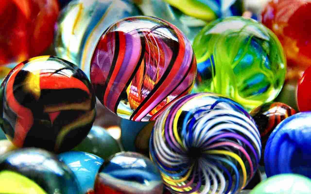
Photo credit: stillbluewaters via Pixabay
Ready to get started?
Are you a consultant? If you are a consultant and wish to contact us for any reason, we invite you to click the ‘Let’s Get in Touch’ button to connect with our team and receive the necessary assistance.
Do you need appropriate and objective advice? Please hit the Request for Proposal button to contact us and learn how we can be of help to you today.